The beginning Graphic Design class discovered their creative selves!
| The Art Teacher - Sarah Wegenast |
|
|
The beginning Graphic Design class discovered their creative selves!
0 Comments
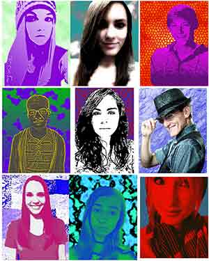
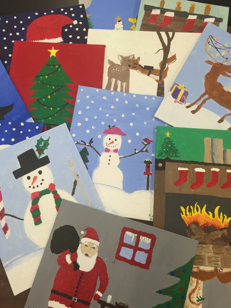
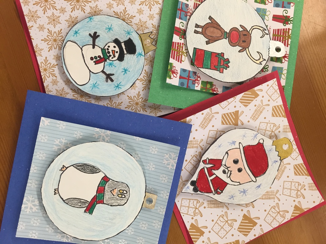
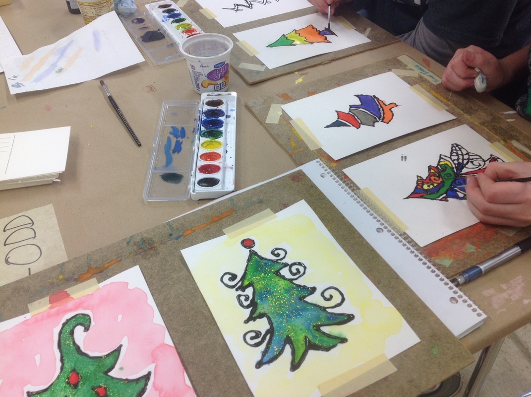
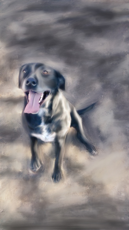
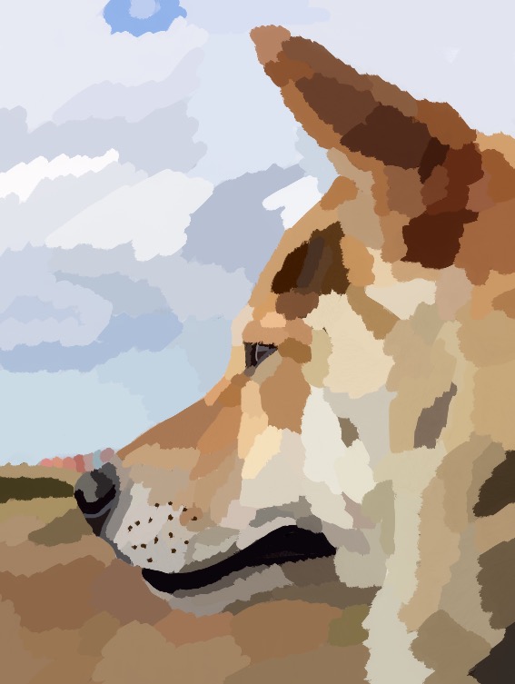
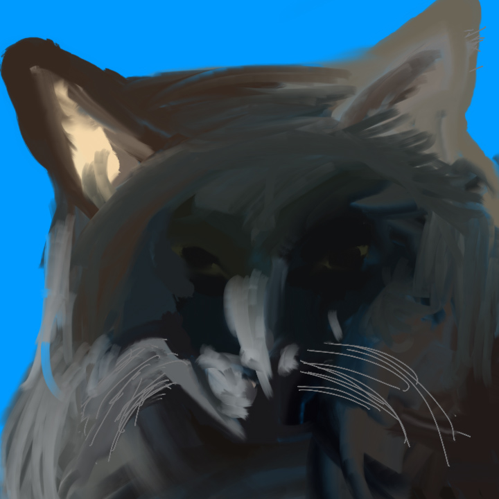
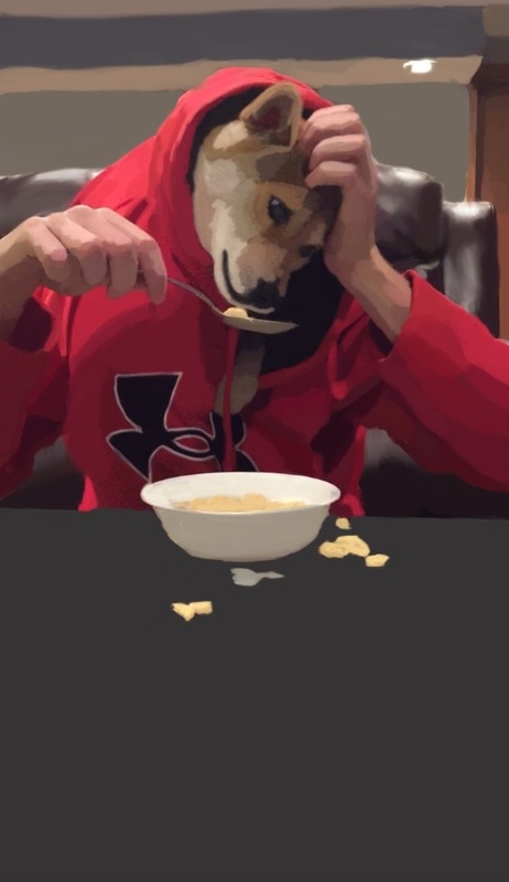
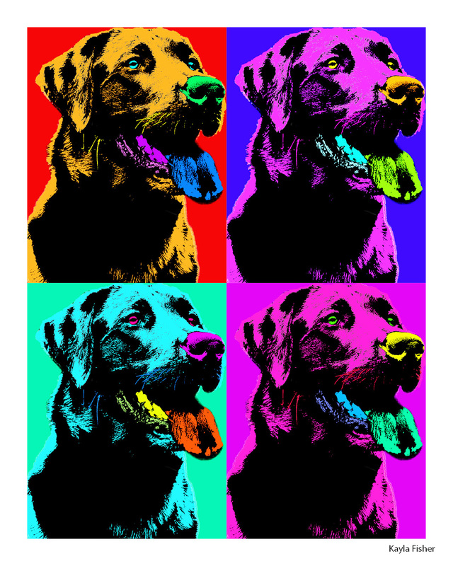
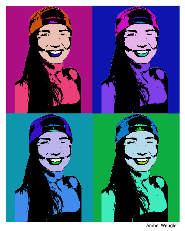
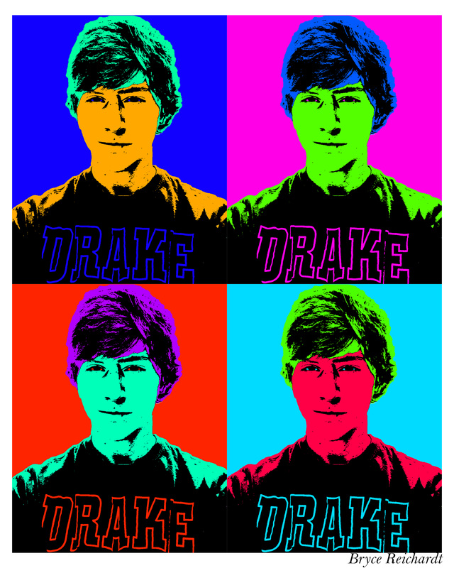
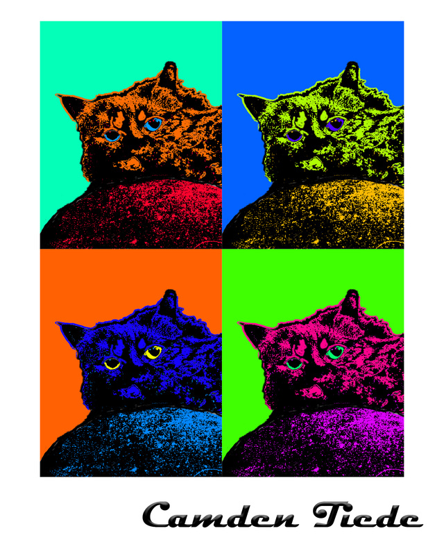
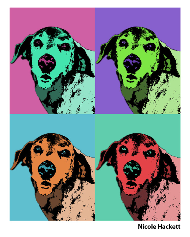
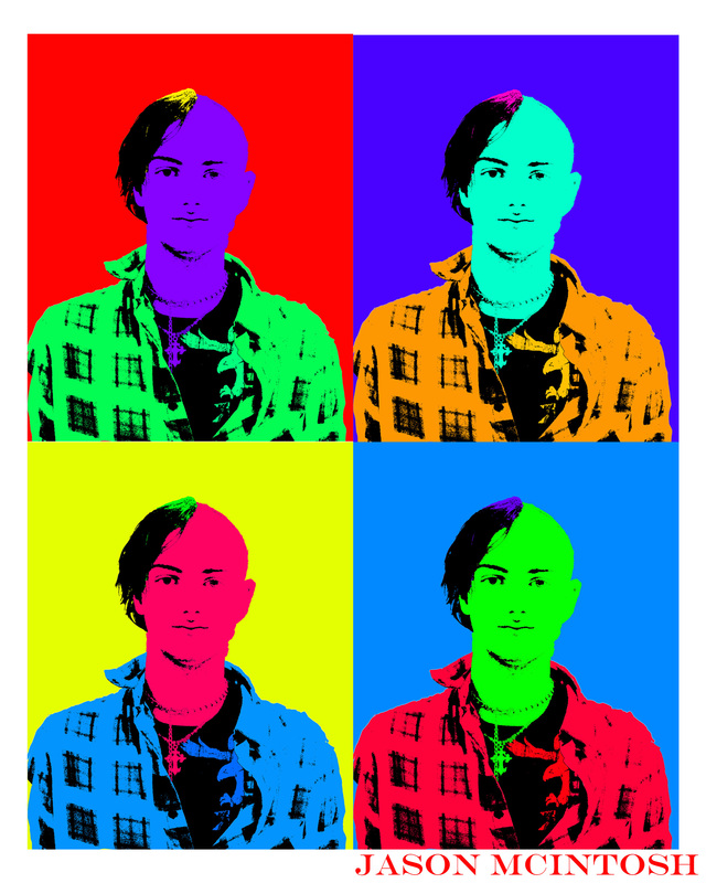
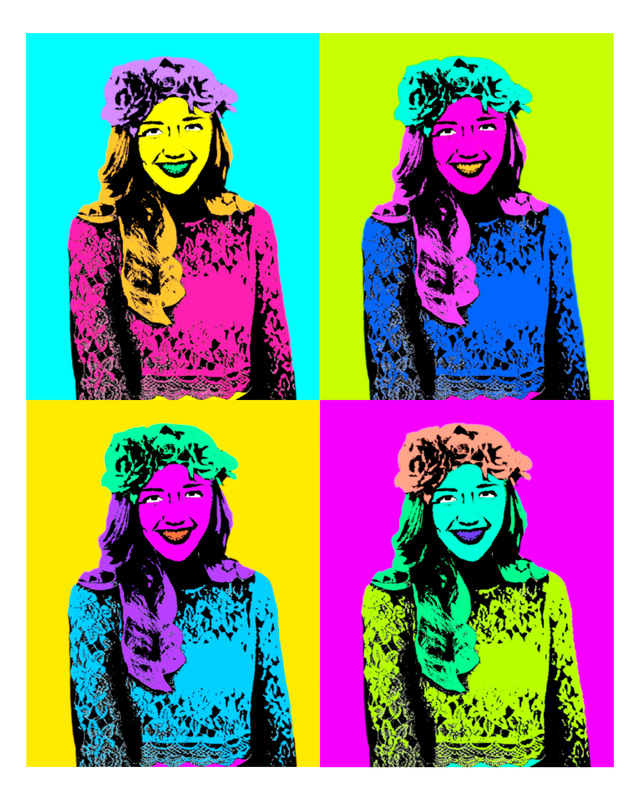
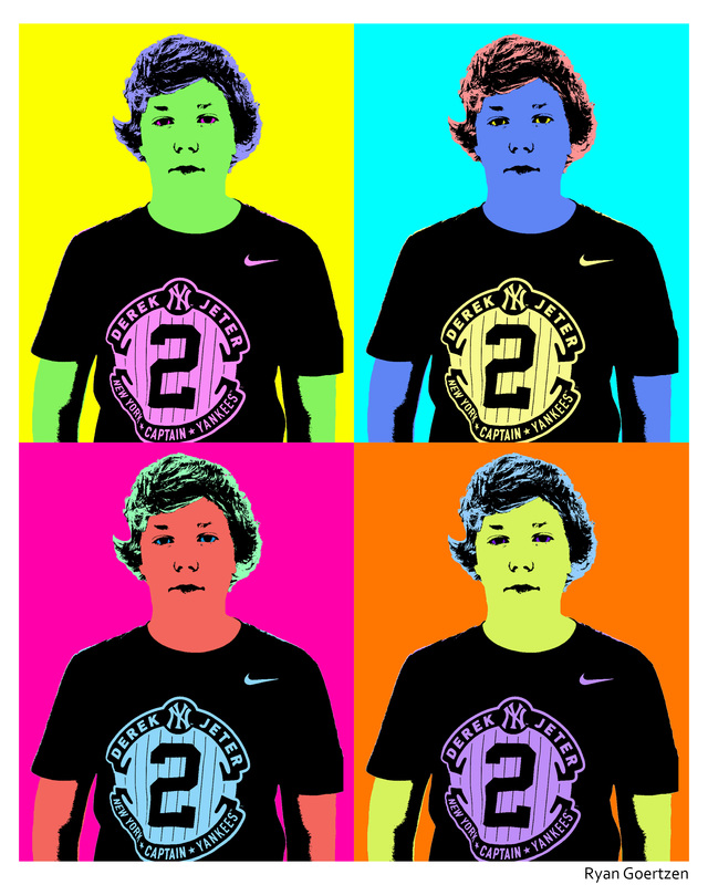
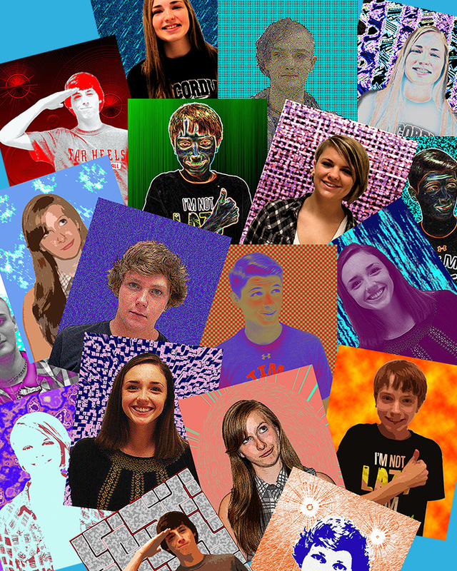
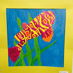
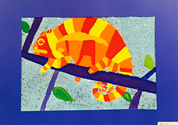
Students were asked to reflect on how they visualize themselves through words and images that best represent themselves. They needed to include their dreams, interests, career goals, and use a variety of art mediums on a 12x12 poster board in a creative design. 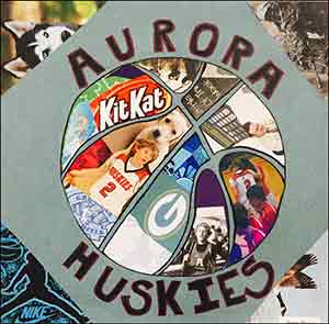 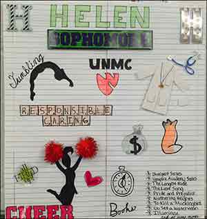 6th grade students love drawing nature. For this assignment students were asked to draw without the use of a visual, only from memory. I collected their memory drawings and then let the students use an image to look at. They were amazed at what they could draw. I wanted the students to understand that we rely on what we think we know verses what reality is. It is important as beginning artists to to LOOK closely and draw slowly to see the details, and proper proportions of a subject. 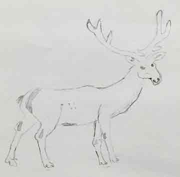 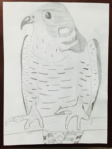 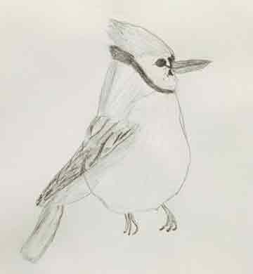 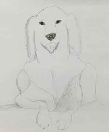 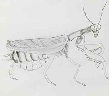 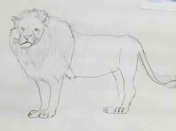 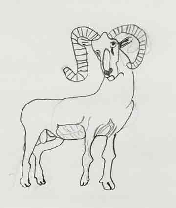 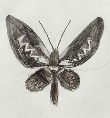 Procreate is a quick and precise drawing and painting app that helps students see the potential of digital art using a mobile device. Procreate is available for $5.99. Students were encouraged to make their subjects personal with their pets, friends. Realistic or Surreal. The Pop Art movement began in the U.S. in the 1950's and 1960's. Large scale silkscreens of celebrities with various color changes was made "popular" by artist Andy Warhol.Students in Graphic Design class created Pop Art Posters using their pets and self-portraits as the subjects. Using Layer, Adjustment and Threshold after images are cropped and cleaned up creates the black white effect. Once the image is colorized using various tools, my favorite is the select, color range, you can then use the Hue/Saturation to finish the colorizing process. A quick Photoshop tutorial to follow this process is from PhotoshopEssentials. Graphic Design students designed digital visitor postcards in the style of the older Vintage posters. Students were introduced to Waverly Campaign Ads. They are very successful in using images in both Type and Images. 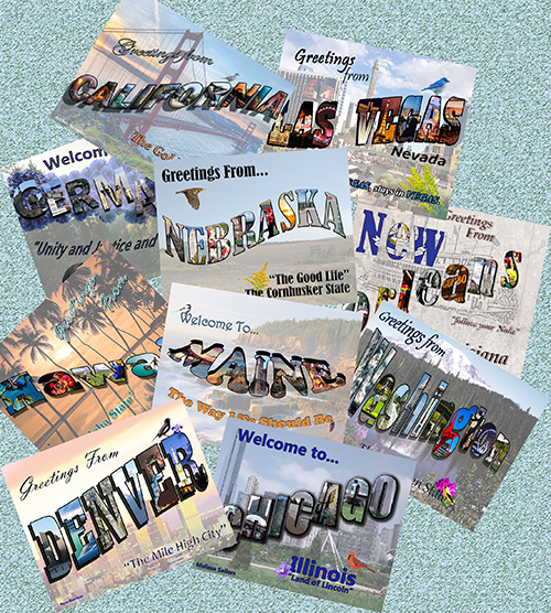 Visual Art students were given an assignment to create a Color Wheel or Spectrum using paint store color chips samples. They could include illustrations, paper cuts, etc. We also looked at a the very creative and popular Sherman Williams ad campaigns using color paint chips. 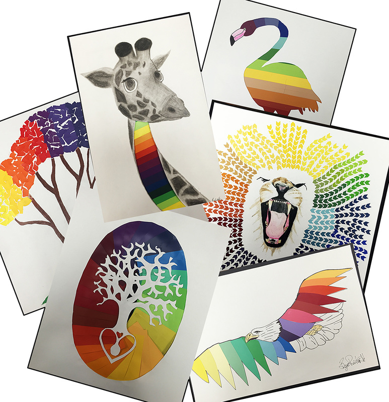
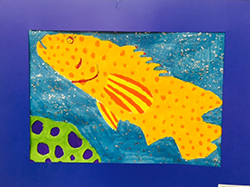
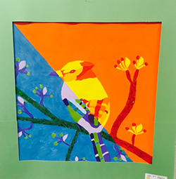
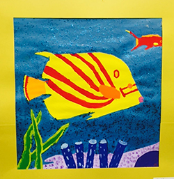
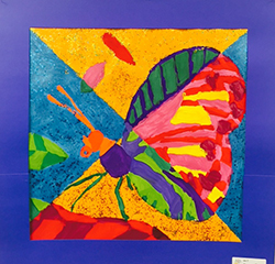
While helping students understand and define color themes, the terms "warm" and cool" are often used to describe a color. In general different blues, greens and violets are considered cool colors while yellows, oranges and reds are considered warm. We associate certain feelings rather than actual temperatures. A warm yellow-orange might feel cozy like by a fire or cool blues feels calming as water by a beach. Warm colors optically tend to advance while cool colors recede. Whatever the color theory process we teach our students, they always seem to choose the one they love the most to be able to create these wonderful paintings. |
Sarah WegenastB.S.;Education, Art Ed. Private Lessons:


Categories
All
Archives
May 2018
|
 RSS Feed
